 Preview unavailable.
Use the source link to view the original.
400 × 397 px · JPEG · The full frame
Sain (Recordiau) Cyf. · CC BY-SA 3.0
More to discover
 Tales Of Inclination
Sain (Recordiau) Cyf. · CC BY-SA 3.0
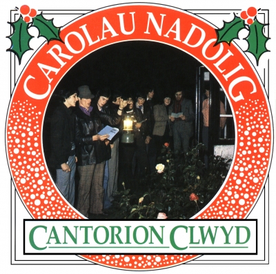 Carolau Nadolig
Sain (Recordiau) Cyf. · CC BY-SA 3.0
 Caneuon Bryn Williams
Sain (Recordiau) Cyf. · CC BY-SA 3.0
 O'r Galon (Deuawd Piano A Thelyn / Piano & Harp Duet)
Sain (Recordiau) Cyf. · CC BY-SA 3.0
Telegysyllta
Celt
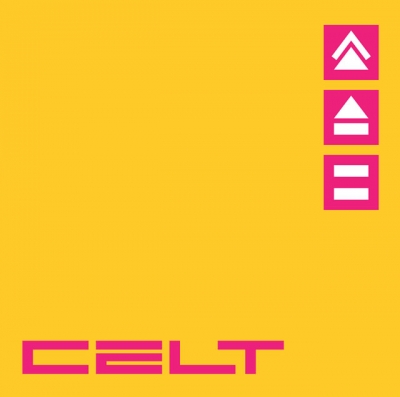
Ep artwork for Celt, provided through the SAIN Records collection on Wikimedia Commons.
Inside the image.
A square, flat graphic on a saturated yellow background. Most of the field is left open, with three small magenta squares stacked vertically near the upper-right edge. Each square contains a simple white geometric emblem: the top shows two angled strokes forming a peaked, open shape; the middle has a broad upward-pointing triangle above a short horizontal bar; the bottom has two horizontal bars of unequal thickness. Near the lower edge, the large magenta word “CELT” stretches across much of the width. Its custom-looking uppercase letters are broad, angular and sharply cut out, with narrow yellow gaps within the C, E and T. The lettering sits close to the bottom margin, while the three emblems form a separate, compact column well above it. There are no visible borders, shadows, gradients, figures or scenery. The colours are even and strongly contrasting, and the clean-edged shapes give the artwork a spare, geometric, digitally rendered appearance.
What the image evokes.
The yellow and magenta make an immediate, high-voltage pairing: the image feels bright and assertive, almost like a sign glimpsed in strong sunlight. Its emptiness gives the few marks room to behave as symbols rather than decoration. The stacked white shapes suggest a small, enigmatic system of signs, while “CELT” anchors the bottom like a nameplate or the wordmark on a piece of equipment. The sharply constructed letters and repeated squares can call to mind late twentieth-century graphic design, arcade interfaces or modernist signage, though the image itself does not settle on any one of those associations. There is a pleasing tension between the warmth of the yellow field and the rigid, almost mechanical precision of the forms: playful in colour, disciplined in arrangement.
Associations are subjective readings, rather than documented influences or statements of the artist’s intention.
Read. Share. Reimagine.
These visual notes are offered under CC BY 4.0. Credit dbcovers, link to the source, keep the licence information and indicate any changes.
Ready-to-use attribution
Other attribution formats are allowed when reasonable for the medium and context. The artwork has its own separate licence.
Lettering & observation notes
- CELT — Large magenta lettering near the bottom of the image.
Artwork sources & licence.
Credit the author and source, link to the licence and indicate any changes. Share adaptations under compatible terms. Read the full licence for details.
- Source year
- 2001
- Source author field
- Sain (Records) Ltd
- Attribution
- Sain (Recordiau) Cyf.
- Collection
- SAIN / Wikimedia Commons
- Catalogue number
- SAIN SCD 2305
- Permission evidence
- Public VRT notice: 2017050910011681
- Source checked
- 20 October 2026

Year as recorded on the source file page; it may not represent the work’s first release. File unchanged; browser preview scaled proportionally.