 Preview unavailable.
Use the source link to view the original.
400 × 397 px · JPEG · The full frame
Sain (Recordiau) Cyf. · CC BY-SA 3.0
More to discover
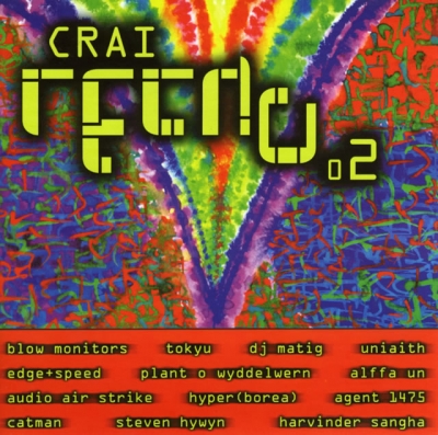 Crai Techno 2
Sain (Recordiau) Cyf. · CC BY-SA 3.0
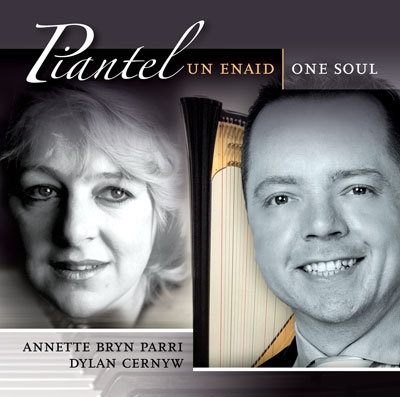 Un Enaid
Sain (Recordiau) Cyf. · CC BY-SA 3.0
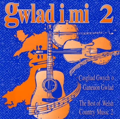 Gwlad I Mi 2
Sain (Recordiau) Cyf. · CC BY-SA 3.0
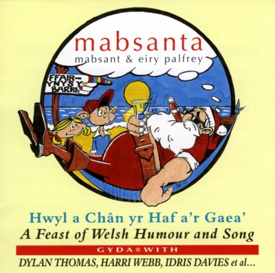 Mabsanta
Sain (Recordiau) Cyf. · CC BY-SA 3.0
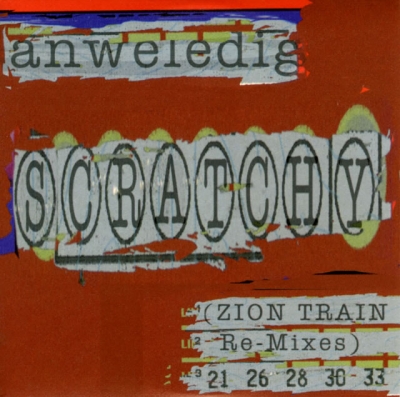
Scratchy
Anweledig
Ep artwork for Anweledig, provided through the SAIN Records collection on Wikimedia Commons.
Inside the image.
A square cover is filled by a roughly painted, saturated red-orange ground, with a narrow dark blue and black strip along the top edge and a thin, uneven violet area visible at the left. The surface looks assembled from torn or cut pieces of paper: edges are ragged, layers overlap, and the lettering sits on pale strips that are marked and mottled. Small scraps and streaks of green, yellow, white and dark colour interrupt the red field, especially around the central lettering and near the lower edge.
The main feature is a broad horizontal strip across the middle, occupying most of the cover’s width. On its pale grey-white backing, the large word “SCRATCHY” is printed in dark, uneven capitals. Each letter is enclosed by a tall, narrow oval, and the ovals overlap or crowd one another, making the word look like a row of linked loops. The letters are irregular in scale and spacing; the final Y sits within a wider oval near the right edge. Behind and around this strip, scraps of pale green and yellow paper form a broken, scalloped border. The strip itself has torn, ragged edges and is interrupted by red and dark marks.
Near the top, a narrower, slightly slanted pale strip carries the lowercase word “unweledig” in large grey-green letters; the spelling is as visible, though the final letters sit close to a torn edge. A thin dark line and a short bright blue band run above it. The upper-right area is mostly uninterrupted red-orange, leaving open space beside the top lettering.
At the bottom right, three short lines of smaller type sit on pale, roughly cut strips. The first appears to read “(ZION TRAIN”, the second “Re-Mixes)”, and the third “21 26 28 30 33”. Small green, white, red and dark marks overlap parts of these lines, and the bottom strip is cropped by the edge of the image. The treatment is graphic rather than photographic, with hand-cut-looking paper shapes, rough edges, uneven ink-like lettering and visible patchwork. The colours are flat and strongly contrasting, without a depicted scene or clear sense of depth.
What the image evokes.
The cover has the restless, handmade feel of a message assembled in a hurry from scraps: a word cut out, ringed, and pinned across a field of red. The repeated oval outlines make “SCRATCHY” seem to stutter or rattle visually, while the rough backing keeps it from settling into a neat logo. The eye follows the loops from left to right, then is pulled down to the smaller, stacked notes at the corner.
The orange-red ground can feel hot and abrasive, but the cool blue sliver at the top and the pale green and yellow scraps add flashes of something more playful. Its layered lettering may call to mind a pasted-up notice, a homemade zine cover, or a fragmentary collage seen on a street wall. These are associations suggested by the rough paper shapes and crowded type, rather than evidence of a particular source or process. There is an appealing tension between the forceful central word and the almost cryptic small print below it: the cover announces itself loudly while leaving part of its message to be puzzled over.
Associations are subjective readings, rather than documented influences or statements of the artist’s intention.
Read. Share. Reimagine.
These visual notes are offered under CC BY 4.0. Credit dbcovers, link to the source, keep the licence information and indicate any changes.
Ready-to-use attribution
Other attribution formats are allowed when reasonable for the medium and context. The artwork has its own separate licence.
Lettering & observation notes
- unwelidig — Near the top, on a narrow pale strip
- SCRATCHY — Across the centre in large oval-framed capitals
- (ZION TRAIN — Lower right, on the first small pale strip
- Re-Mixes) — Lower right, on the second small pale strip
- 21 26 28 30 33 — Along the bottom right
- The top word appears to read “unweledig”; its final letters are close to a ragged edge and may be difficult to distinguish.
- The opening parenthesis before “ZION TRAIN” is visible, but any closing parenthesis on that line is unclear.
Artwork sources & licence.
Credit the author and source, link to the licence and indicate any changes. Share adaptations under compatible terms. Read the full licence for details.
- Source year
- 2000
- Source author field
- Sain (Records) Ltd
- Attribution
- Sain (Recordiau) Cyf.
- Collection
- SAIN / Wikimedia Commons
- Catalogue number
- CRAI CD070
- Permission evidence
- Public VRT notice: 2017050910011681
- Source checked
- 20 October 2026

Year as recorded on the source file page; it may not represent the work’s first release. File unchanged; browser preview scaled proportionally.