 Preview unavailable.
Use the source link to view the original.
400 × 397 px · JPEG · The full frame
Sain (Recordiau) Cyf. · CC BY-SA 3.0
More to discover
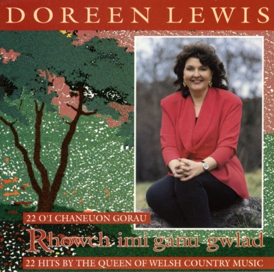 Rhowch Imi Ganu Gwlad
Sain (Recordiau) Cyf. · CC BY-SA 3.0
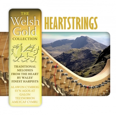 Heartstrings (The Welsh Gold Collection)
Sain (Recordiau) Cyf. · CC BY-SA 3.0
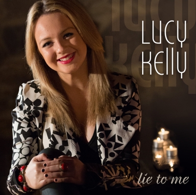 Lie To Me
Sain (Recordiau) Cyf. · CC BY-SA 3.0
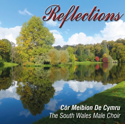 Reflections
Sain (Recordiau) Cyf. · CC BY-SA 3.0
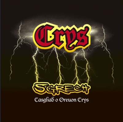
Sgrech (Casgliad O Oreuon Crys)
Crys
Album artwork for Crys, provided through the SAIN Records collection on Wikimedia Commons.
Inside the image.
A square cover is dominated by a large, stylised red wordmark near the upper centre. Its ornate, blackletter-like letters have thick yellow edging and a dark shadow, making them stand out against a nearly black background. Below it, a cluster of jagged lightning bolts spreads downwards from a cloudy, smoky band across the upper half. The bolts are pale yellow to white, with a bright central strike and thinner branching lines; some reach towards the lower edge of the dark cloud while others fork across it.
The bottom half is mostly open, very dark brown-black space. Near its top sits a second, smaller line of lettering in an irregular, hand-drawn-looking style: yellow outlines surround dark interiors, with a slight black shadow. Beneath that is a fine white line of ornate lettering, centred and much smaller. The readable text is transcribed below; the smallest inscription is legible but its letterforms are delicate.
The artwork uses a restricted palette of black, deep brown, muted olive, yellow, red and white. A faint olive-yellow glow around the lightning and lettering softens the transition between the cloudy upper area and the plain dark lower field. The image appears to combine stylised lettering with an illustrated or digitally rendered storm effect. There is no visible frame or border; the elements are centred, with broad dark margins around them.
What the image evokes.
The cover turns a storm into a kind of stage lighting. The lightning seems to flare behind the large wordmark, giving the letters a theatrical presence, while the dark lower half acts like a curtained space left open for the smaller inscriptions. The contrast between the red centre of the main lettering and its bright yellow outline lends it a sign-like force, as if it were glowing against a night sky.
The ornate top lettering suggests old printed titles or gothic display lettering, but its vivid colours and exaggerated outline also make it feel playful and emphatic. The sketched, uneven lettering below shifts the mood towards something more handmade. Together, these treatments create a tension between the grand and the informal: a dramatic storm backdrop paired with typography that feels deliberately lively rather than solemn. The image can evoke a theatrical poster, a fantasy title card or a vintage adventure illustration, without settling into any one of those associations.
Associations are subjective readings, rather than documented influences or statements of the artist’s intention.
Read. Share. Reimagine.
These visual notes are offered under CC BY 4.0. Credit dbcovers, link to the source, keep the licence information and indicate any changes.
Ready-to-use attribution
Other attribution formats are allowed when reasonable for the medium and context. The artwork has its own separate licence.
Lettering & observation notes
- Crys — Upper centre, in large red and yellow lettering
- Sgrech — Below the lightning, in yellow outlined lettering
- Casgliad o Oreuon Crys — Centred beneath “Sgrech”, in small white ornate lettering
Artwork sources & licence.
Credit the author and source, link to the licence and indicate any changes. Share adaptations under compatible terms. Read the full licence for details.
- Source year
- 2006
- Source author field
- Sain (Records) Ltd
- Attribution
- Sain (Recordiau) Cyf.
- Collection
- SAIN / Wikimedia Commons
- Catalogue number
- SAIN SCD 2535
- Permission evidence
- Public VRT notice: 2017050910011681
- Source checked
- 20 October 2026

Year as recorded on the source file page; it may not represent the work’s first release. File unchanged; browser preview scaled proportionally.