 Preview unavailable.
Use the source link to view the original.
400 × 397 px · JPEG · The full frame
Sain (Recordiau) Cyf. · CC BY-SA 3.0
More to discover
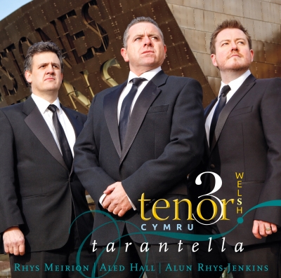 Tarantella
Sain (Recordiau) Cyf. · CC BY-SA 3.0
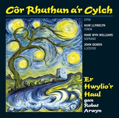 Er Hwylio'r Haul
Sain (Recordiau) Cyf. · CC BY-SA 3.0
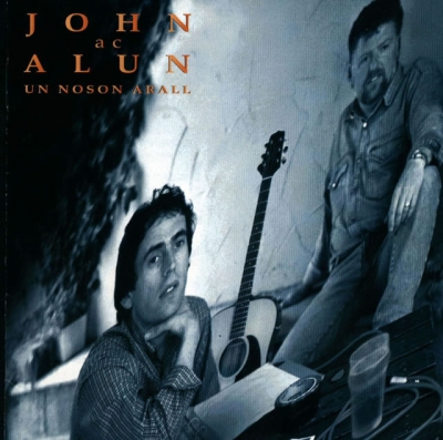 Un Noson Arall
Sain (Recordiau) Cyf. · CC BY-SA 3.0
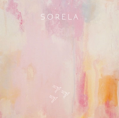 Sorela
Sain (Recordiau) Cyf. · CC BY-SA 3.0
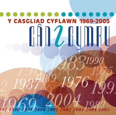
Can I Gymru (Y Casgliad Cyflawn: 1969
Amrywiol
Album artwork for Amrywiol, provided through the SAIN Records collection on Wikimedia Commons.
Inside the image.
A square cover built from overlapping, translucent circles and discs in a layered, graphic composition. A white band across the upper portion provides a relatively open area for the title. Along its top edge runs a row of small dots, beginning in yellow-green at the left and changing through turquoise to dark teal at the right. Beneath them, a bold red line of uppercase text reads “Y CASGLIAD CYFLAWN 1969-2005”. Below this, the much larger title “CAN I GYMRU” is set in tall, narrow capitals: most letters are dark blue, while the central “I” is turquoise. The lettering sits over the pale background and partly overlaps the coloured forms below.
The lower two-thirds are crowded with overlapping circles of different sizes. They range from pale grey and powder blue through turquoise, teal, ochre, orange, rust, burgundy and deep plum. Some are translucent, so their intersections form darker or altered-colour patches; others appear more opaque. A broad blue disc occupies much of the upper middle, while warm orange and brown circles spread across the lower left and centre. Darker red and purple discs gather towards the lower right. The largest shapes are cropped by the edges, and no border separates the artwork from the frame. The circles create a flat, layered depth without depicting recognisable objects or scenery.
Numerals in a pale, fine italic serif typeface are scattered over the circles, at varied sizes and angles. Several are legible, including “1983”, “1998”, “1975”, “1987”, “1989”, “1976” and “2004”; other date-like numerals are partly cut off by the edges or obscured by overlapping colours. A smaller red line of years runs along the bottom, with “1998 1999 2000 2001 2002 2003 2004 2005” visible. The mix of narrow display capitals, heavy red heading and delicate, slanting numerals makes the typography a prominent part of the design. The image has a clean, flat-colour graphic treatment, with softly blended overlaps and no visible photographic subject or surface texture.
What the image evokes.
The circles suggest a visual field in motion: they overlap like bubbles, coloured glass or planets passing across one another, while the scattered years act as markers suspended in that field. Their varying transparency makes the arrangement feel less like a strict grid than a gathering of fragments, each with its own weight and orbit.
There is a lively tension between the measured title at the top and the unruly abundance below. The tall, compressed lettering feels upright and declarative; the numerals drift, tilt and fade into the circles. Warm reds and ochres lend the lower half a sense of warmth and density, while the cool blue and turquoise shapes above open a brief, airy interval. The result can suggest a timeline, a collage of memories, or a constellation of dates, without settling into any single reading. Its combination of bold display lettering, simple geometry and layered colour has a distinctly graphic, poster-like energy.
Associations are subjective readings, rather than documented influences or statements of the artist’s intention.
Read. Share. Reimagine.
These visual notes are offered under CC BY 4.0. Credit dbcovers, link to the source, keep the licence information and indicate any changes.
Ready-to-use attribution
Other attribution formats are allowed when reasonable for the medium and context. The artwork has its own separate licence.
Lettering & observation notes
- Y CASGLIAD CYFLAWN 1969-2005 — Across the upper portion, in bold red capitals.
- CAN I GYMRU — Large, narrow capitals beneath the red heading.
- 1983 — Large pale italic numerals near the centre-right.
- 1998 — Pale italic numerals in the upper-right area.
- 1975 — Pale italic numerals on the right, below “1998”.
- 1987 — Pale italic numerals in the left-centre.
- 1989 — Pale italic numerals just left of centre.
- 1976 — Pale italic numerals near the centre.
- 2004 — Large pale italic numerals in the lower centre.
- 1998 1999 2000 2001 2002 2003 2004 2005 — Small red numerals along the bottom edge.
- Additional pale numerals appear across the circles, but several are cropped at the edges or overlapped and cannot be read confidently.
Artwork sources & licence.
Credit the author and source, link to the licence and indicate any changes. Share adaptations under compatible terms. Read the full licence for details.
- Source year
- 2005
- Source author field
- Sain (Records) Ltd
- Attribution
- Sain (Recordiau) Cyf.
- Collection
- SAIN / Wikimedia Commons
- Catalogue number
- SAIN SCD 2494
- Permission evidence
- Public VRT notice: 2017050910011681
- Source checked
- 20 October 2026

Year as recorded on the source file page; it may not represent the work’s first release. File unchanged; browser preview scaled proportionally.