 Preview unavailable.
Use the source link to view the original.
400 × 397 px · JPEG · The full frame
Sain (Recordiau) Cyf. · CC BY-SA 3.0
More to discover
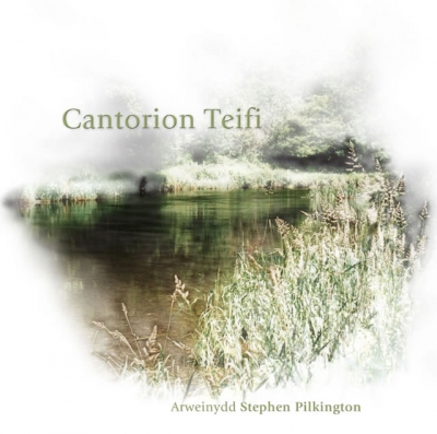 Cantorion Teifi
Sain (Recordiau) Cyf. · CC BY-SA 3.0
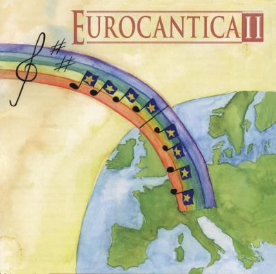 Eurocantica Ii
Sain (Recordiau) Cyf. · CC BY-SA 3.0
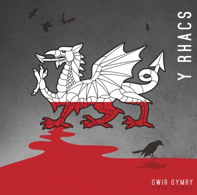 Gwir Gymry
Sain (Recordiau) Cyf. · CC BY-SA 3.0
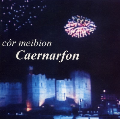 Côr Meibion Caernarfon
Sain (Recordiau) Cyf. · CC BY-SA 3.0
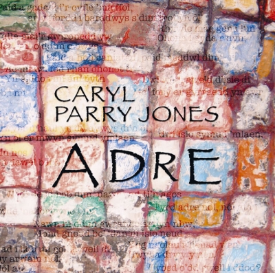
Adre
Caryl Parry Jones
Album artwork for Caryl Parry Jones, provided through the SAIN Records collection on Wikimedia Commons.
Inside the image.
A square cover is filled edge to edge with a close view of a rough, irregularly gridded surface resembling painted masonry. Uneven rectangular blocks are divided by thick, dark seams; their chipped, mottled faces vary from pale cream and dusty pink to ochre, rust red, muted blue, green and grey. Brushy marks and patches of colour overlap, with darker areas collecting around some edges. There is no separate border or clear background beyond this wall-like pattern.
Large black lettering occupies the centre. The smaller two-line name “CARYL / PARRY JONES” sits above the much larger word “ADRE”, whose widely spaced capitals stretch across the central blocks. The letters are plain, narrow and hand-drawn in appearance, with slight irregularities in their outlines. Behind and across the lettering, faint lines of smaller writing in several colours appear to be scattered over the painted surface. They are too obscured and indistinct to read with confidence. The image has a flat, layered appearance: the lettering and marks sit on the same busy, textured plane, without a clear sense of depth or directional lighting.
What the image evokes.
The cover suggests a wall that has accumulated marks over time: patched paint, weathered brickwork and scraps of writing seem to coexist without resolving into a single scene. The central black lettering gives the eye a firm place to land, while the softer, half-lost words and variegated blocks keep pulling attention outward. It feels at once organised and unruly, held together by the masonry grid but loosened by the colours and overlapping marks.
There is a handmade, lived-in quality to the surface, like a neighbourhood wall, an old noticeboard or a page repeatedly written over. Its faded tones carry a gentle air of age, though the brighter blue and orange patches keep it from feeling simply muted or nostalgic. The name across the middle reads almost like a title painted onto the wall, while the scattered script makes the whole cover feel as if it contains many quieter voices beneath the most legible one.
Associations are subjective readings, rather than documented influences or statements of the artist’s intention.
Read. Share. Reimagine.
These visual notes are offered under CC BY 4.0. Credit dbcovers, link to the source, keep the licence information and indicate any changes.
Ready-to-use attribution
Other attribution formats are allowed when reasonable for the medium and context. The artwork has its own separate licence.
Lettering & observation notes
- CARYL PARRY JONES — Upper centre, in two lines above the main lettering.
- ADRE — Across the centre in large capitals.
- Faint writing scattered across the background is too obscured to transcribe reliably.
Artwork sources & licence.
Credit the author and source, link to the licence and indicate any changes. Share adaptations under compatible terms. Read the full licence for details.
- Source year
- 2004
- Source author field
- Sain (Records) Ltd
- Attribution
- Sain (Recordiau) Cyf.
- Collection
- SAIN / Wikimedia Commons
- Catalogue number
- SAIN SCD 2462
- Permission evidence
- Public VRT notice: 2017050910011681
- Source checked
- 20 October 2026

Year as recorded on the source file page; it may not represent the work’s first release. File unchanged; browser preview scaled proportionally.